

You have a brilliant idea for a website, but the moment you open a design tool, you freeze. Sound familiar? Before pixels, colors, and fonts come into play, every great website starts as a rough sketch called a wireframe. The good news? You don’t need to be a designer to create one.
This guide covers wireframing basics for beginners, walking you through the exact process to turn your ideas into low-fidelity website layouts. No design degree required, no fancy software needed. Just you, a clear goal, and a few simple steps.
What Is a Wireframe (and Why Should You Care)?
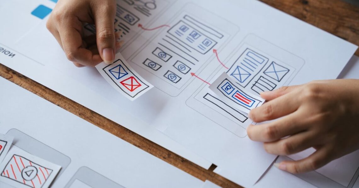
A wireframe is a simplified visual blueprint of a webpage. Think of it as the skeleton of your website: no colors, no images, no styled fonts. Just boxes, lines, and placeholders showing where each element will live.
Wireframes exist to answer three questions before you invest hours in visual design or development:
- What content goes on the page?
- Where does each piece of content sit?
- How will users navigate and interact with it?
By solving structure first, you avoid expensive rework later. That’s why product teams, freelancers, and founders swear by them.
Low-Fidelity vs. High-Fidelity Wireframes
| Low-Fidelity | High-Fidelity |
|---|---|
| Hand-drawn or basic shapes | Digital, detailed, pixel-accurate |
| Fast to create and change | Time-consuming, closer to final design |
| Best for brainstorming | Best for stakeholder approval |
| No colors, no real text | Includes typography and spacing details |
As a beginner, start with low-fidelity. You’ll iterate faster and stress less.

What You Need to Get Started
You can wireframe with almost nothing. Here are your options:
Analog Tools (Recommended for Beginners)
- A blank sheet of paper or a notebook
- A pencil and eraser
- A ruler (optional, but helpful)
- Sticky notes for movable elements
Free Digital Tools
- Figma – free tier, browser-based, huge community
- Balsamiq – designed to feel like sketching
- Excalidraw – free, open-source, hand-drawn style
- Whimsical – great for flow diagrams and wireframes
- MockFlow – beginner-friendly with ready-made templates
Our tip: sketch on paper first, then move to a digital tool once your idea is solid. It keeps you focused on structure instead of getting distracted by tool features.

Common Wireframe Symbols You Should Know
Wireframes use a shared visual language. Learning these basic symbols will save you (and your teammates) tons of confusion.
| Symbol | What It Represents |
|---|---|
| Rectangle with an X through it | Image or media placeholder |
| Horizontal lines (zigzags) | Body text or paragraph |
| Thick solid line | Heading or title |
| Rectangle with rounded corners | Button or call-to-action |
| Three stacked lines (hamburger) | Mobile menu |
| Magnifying glass icon | Search field |
| Dashed box | Optional or dynamic content |
How to Sketch Your First Website Layout: 7 Steps
Step 1: Define the Goal of the Page
Every page needs one clear job. Is it to capture emails? Sell a product? Explain a service? Write your goal at the top of the page before you draw anything. If you can’t summarize it in one sentence, you’re not ready to wireframe yet.
Step 2: Know Your Users and Their Flow
Ask: who lands on this page and what do they want to do next? Map a simple user flow. For example: Homepage → Pricing → Sign-up form → Confirmation. This helps you decide which elements to prioritize.
Step 3: Choose Your Canvas Size
Are you designing for desktop, tablet, or mobile? Standard starting points:
- Desktop: 1440 x 900 pixels
- Tablet: 768 x 1024 pixels
- Mobile: 375 x 812 pixels
On paper, just draw a rectangle with the right aspect ratio. In 2026, mobile-first wireframing is still the smartest starting point since most web traffic happens on phones.
Step 4: Block Out the Main Sections
Divide your canvas into rough zones: header, hero section, content blocks, sidebar (if any), and footer. Don’t worry about details yet. Just get the skeleton down.
Step 5: Add Content Placeholders
Now fill each zone with symbols from the table above. Add navigation links, headings, images, buttons, and text blocks. Use real (but short) labels like “Sign Up Free” instead of “Lorem ipsum” whenever possible. It makes the layout easier to evaluate.
Step 6: Prioritize with Visual Hierarchy
The most important element should be the biggest and most visible. Ask yourself: if a user only looked at this page for 3 seconds, what would they notice first? That element deserves the most real estate.
Step 7: Get Feedback and Iterate
Show your sketch to a friend, teammate, or potential user. Ask them to describe what they see and where they’d click. If they hesitate or misunderstand, that’s gold. Redraw and repeat until the structure feels obvious.

Beginner Mistakes to Avoid
- Adding color too early. Wireframes are about structure, not aesthetics. Stick to black, white, and grays.
- Using real images and polished text. This distracts reviewers from the layout itself.
- Cramming too much on one page. If it feels overwhelming as a sketch, it will feel worse as a live site.
- Skipping the user flow. A beautiful wireframe with no purpose is just decorated paper.
- Falling in love with your first draft. Wireframes are meant to be thrown away. Iterate fast.
- Ignoring mobile. If your layout only works on desktop, you’re already behind.
- Trying to make it look perfect. Sloppy sketches invite honest feedback. Polished ones intimidate reviewers.
A Quick Example: Wireframing a Simple Landing Page
Let’s say you’re building a landing page for a fitness app. Here’s how a low-fidelity wireframe might come together:
- Header: Logo on the left, three nav links (Features, Pricing, Login) on the right
- Hero section: Big headline (“Get Fit in 15 Minutes a Day”), short subheading, one button (“Start Free Trial”), image placeholder on the right
- Features block: Three columns, each with an icon placeholder, a subheading, and two lines of text
- Testimonial section: One quote block with a user photo placeholder
- Call-to-action: Repeat of the sign-up button
- Footer: Simple links row, copyright text
That’s it. No colors, no fonts, no drama. Just a clear structure you can validate in minutes.

From Wireframe to Website: What Comes Next?
Once your wireframe is validated, the next stages typically include:
- Mockups: Add colors, typography, and images to bring your wireframe to life visually.
- Prototypes: Link screens together so you can click through the flow like a real website.
- Development: Hand off your designs to a developer (or start building yourself).
Each stage builds on the previous one. Skip wireframing and you’ll pay for it later in wasted design and dev hours.
Frequently Asked Questions
Do I need to know how to draw to create wireframes?
No. If you can draw a rectangle and a straight line, you can wireframe. The point isn’t artistic quality, it’s clarity.
How long should a wireframe take?
A rough sketch for a single page can take 15 to 30 minutes. A full website wireframe with multiple pages might take a few hours. Speed matters more than polish.
Should I wireframe every single page of a website?
Wireframe your key templates: homepage, landing page, product page, blog post, contact page. If two pages share the same layout, you only need one wireframe.
What’s the best free tool for beginners in 2026?
Figma remains the most popular choice because it’s free, works in your browser, and has a massive library of beginner templates. Excalidraw is a great alternative if you prefer a hand-drawn feel.
Can I show a wireframe to a client?
Absolutely. In fact, showing low-fidelity wireframes early sets the right expectations. Just explain that colors, fonts, and images will come later. Focus the conversation on structure and functionality.
What’s the difference between a wireframe and a mockup?
A wireframe is the black-and-white skeleton. A mockup is the full visual design with colors, typography, and branding applied. Wireframe first, mockup second.
Final Thoughts
Wireframing isn’t about making pretty drawings. It’s about thinking clearly before you build. Every hour spent sketching saves five hours of redesign and development later. Grab a pencil, pick one page from a project you’ve been putting off, and try the seven steps above. Your future self (and your users) will thank you.
Ready to turn your wireframes into stunning, conversion-focused websites? Explore how Purlize helps teams move from idea to launch faster than ever.